The Gestalt Principles of Graphic Design
Similarity- http://www.andyrutledge.com/gestalt-principles-2-similarity.php
 This article talks about how the similarity between elements can be perceived as similarity of color, size, shape, texture, dimension, and orientation. It says that the similarity of color is the strongest relationship and usually the first thing the viewer notices.
The authors argument is how similarity is harder to see than some might think. He demonstrates several examples using web design and he goes over the elements (color, size, shape, etc.) to help prove his argument. This evidence is very convincing and it definitely helps me expand my knowledge.
Continuation- http://www.andyrutledge.com/gestalt-principles-3.php
The articles explains that continuation occurs when the readers eye is compelled to move through one object and continue to another object. The author also states that good continuation allows us to understand the meaning thanks to all the visual structures.

Closure- http://www.andyrutledge.com/closure.php
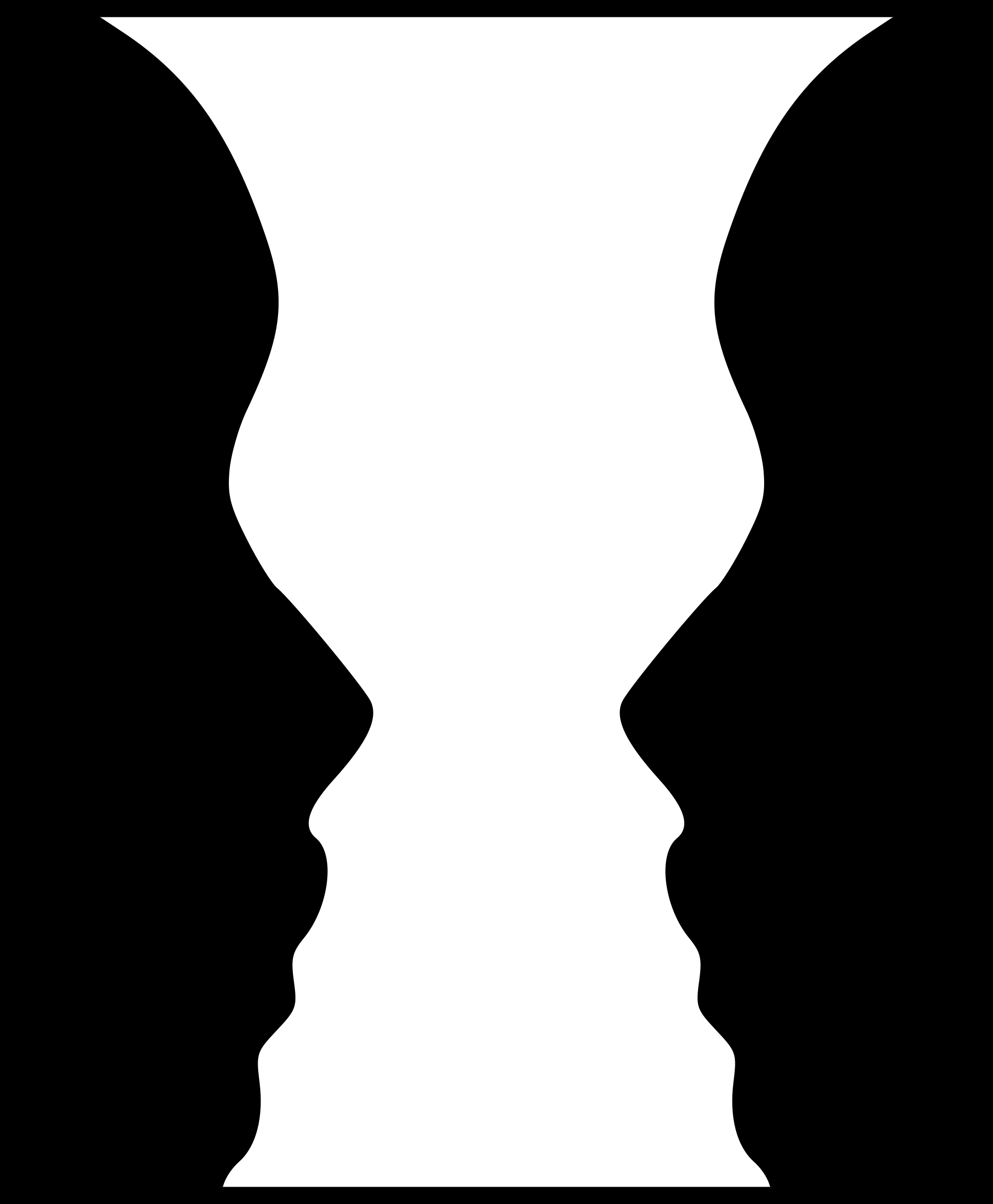
 Closure occurs when the object is incomplete or a space is not completely enclosed. If enough of the shape is indicated usually the viewer can fill in the missing space of the image to make it seem whole. The principle of closure happens in every decision we make and it sometimes leads to consequences when misused.
The author really helps define how closure affects design. He explains that humans naturally draw conclusion from not complete things and that closure occurs naturally. Another thing is that to make the closure element effective you have to make it easy for it to occur. In my opinion the author did a great job in explaining why the element of closure is needed and how it can be applied to graphic design.
Proximity- http://www.andyrutledge.com/gestalt-principles-3.php
Proximity tends to occur when a set of objects are placed closed together, leading them to be perceived as a group. It is one of the first principles that effect our perception and from which we derive understanding. Proximity tends to overpower other elements like in this example that was given by the author.
 The author also claims that uniform connectedness also leads to the elements being connected by a line being perceived as greater than the elements not connected by the line. The points made in this article were really significant and really helped broaden the vision on the element of proximity.
Figure/Ground- http://www.andyrutledge.com/gestalt-principles-1-figure-ground-relationship.php
 Figure/Ground occurs when the certain element is perceived as either figures, or ground. Stated in the article, The viewer distinguishes the figure/ground relationship from right as they first look at the piece. Most humans distinguish the relationship with ease because they are in familiar surroundings, but when the figure/ground relationship is harder to see it can lead to either success and failure.
The authors examples kind of made the whole figure/ground explanation confusing for me. Like, I understood what he was talking about, but the example images he showed completely threw me off. Other than that I think the author really hit the nail on the head when explaining this element.
Symmetry and order- http://facweb.cs.depaul.edu/sgrais/gestalt_principles.htm
The article explains that symmetry should be well balanced while order should provide consistency and structure. The way the element is perceived will be based off of the viewers personality or how the element is communicated with the piece.
 Most viewers are used to things being in orderly manner and will probably lead to frustration if the particular item is hard to comprehend. The goal of symmetry and order is to be equally engaging and structured. The author gave sort of a brief description of what this element is and I think more examples would of helped me have a better understanding of this principle.
No comments:
Post a Comment